Progress rings
Concentric activity-style rings.
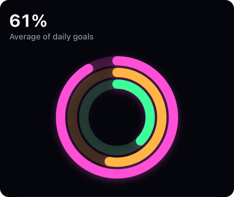
Screenshot from the example app. Run it to try every option live.
Usage
import { ProgressRings } from 'react-native-skia-chart';

<ProgressRings width={220} height={220} data={[{ progress: 0.8, color: '#FF6B9A' }, { progress: 0.6, color: '#4CD97B' }]} />
Props
| Prop | Type | Default | Notes |
|---|---|---|---|
data | { progress, color, backgroundColor?, label? }[] | — | progress in 0..1. |
thickness | number | 18 | |
gap | number | 4 | |
trackOpacity | number | 0.2 | |
ProgressRing | { progress, color, … } | Single ring shortcut. |
All charts also accept the shared props: width, height, padding, style, backgroundColor, animation, font, effects and gradient.
Gradient
<ProgressRings {...props} gradient={{ type: 'sweep', colors: ['#7C5CFF', '#00D2D3', '#7C5CFF'] }} />
GPU notes
Ring sweeps animate with Reanimated end values on the UI thread.